You have two choices when deciding what to build next: engage in guesswork or reach out to your customers to find out what they need.
The hard part is not improving your products and building new features, the hard part is understanding your users and their needs.
Here is how top companies get customer feedback and what we can all learn from them.
Jira
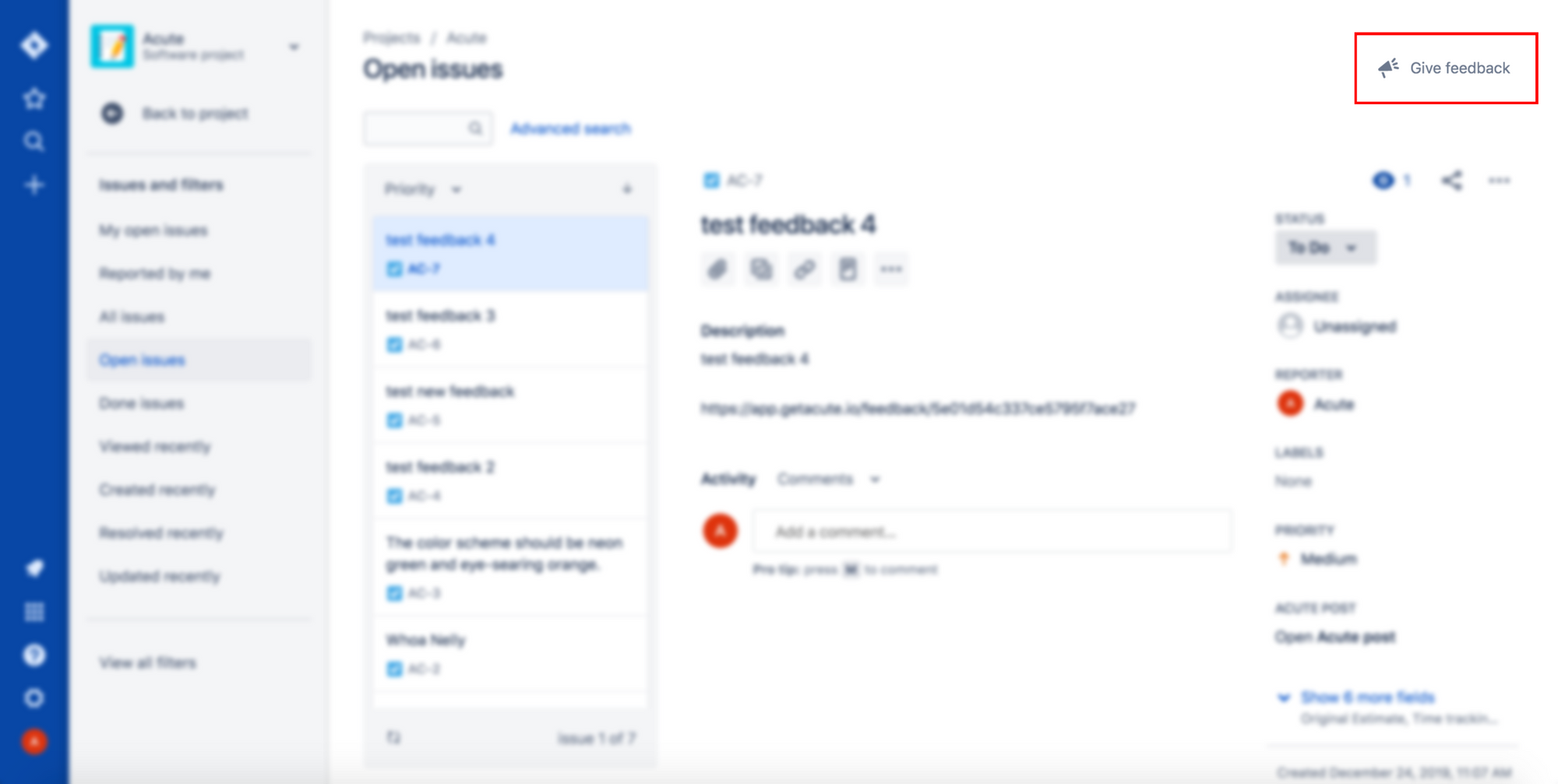
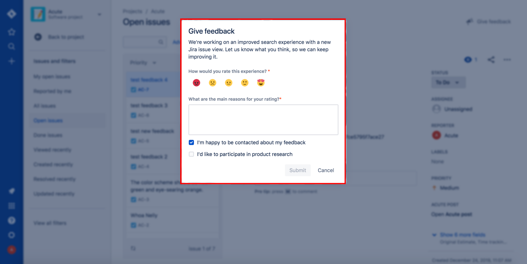
Jira understands that the best feedback is collected when the user has an impulse to provide it.
They have a subtle Give feedback button in the top right corner of their page that triggers a pop-up form. The form asks for specific feedback regarding the current page that you are on and has a checkbox for agreeing to a followup.
This type of feedback collection ensures users that Jira cares about their feedback, are willing to listen and gives them an easy and open channel to do so. This makes Jira's customers feel more connected to the service and company.
Airbnb
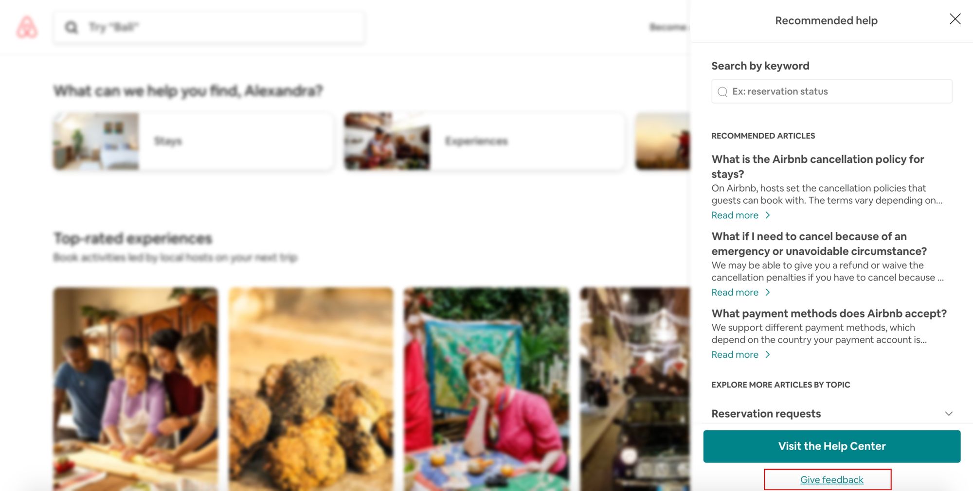
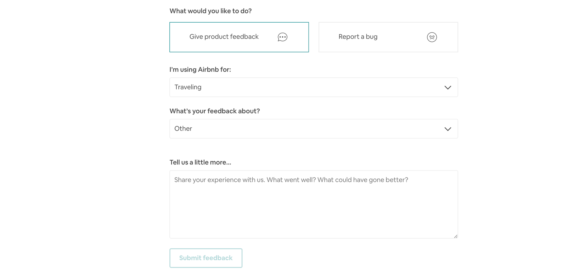
Similarly, Airbnb has a subtle Give feedback link in their help section. The link takes you to a feedback form which has two questions: What are you using Airbnb for and What is your feedback about.
By asking users these two questions Airbnb does a great job of putting the customer feedback into context. They can form a customer persona (traveler vs host) and the product they are giving feedback on (web vs mobile app vs messaging). This way the feedback can be analyzed and Airbnb can find patterns and underlying issues from their customer feedback.
Lastly, Airbnb suggests that you let them know what went well from your experience and what could have gone better. This is extremely powerful as it helps them set in place already working processes that customers are happy with and do not need change, and see aspects of their processes that are not working for their customers and that they should improve on.
Slack
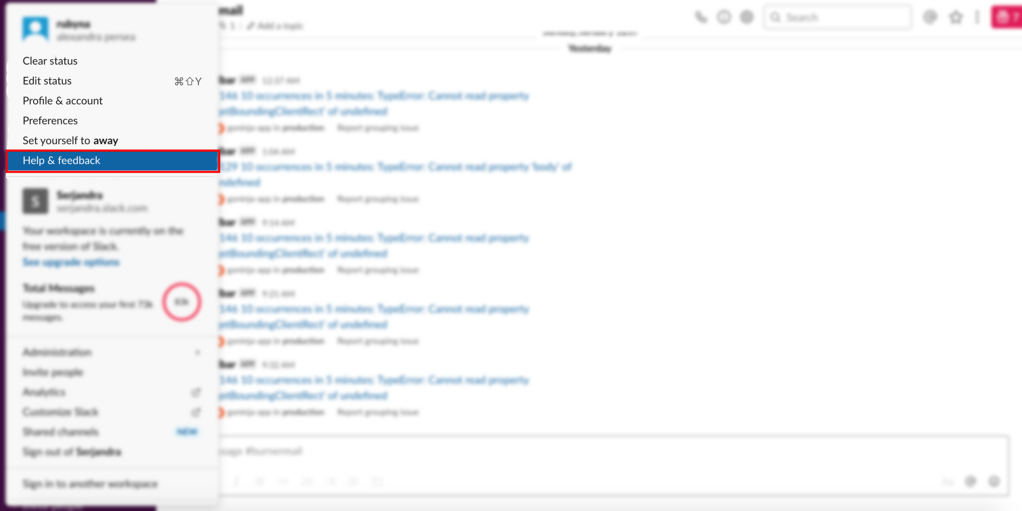
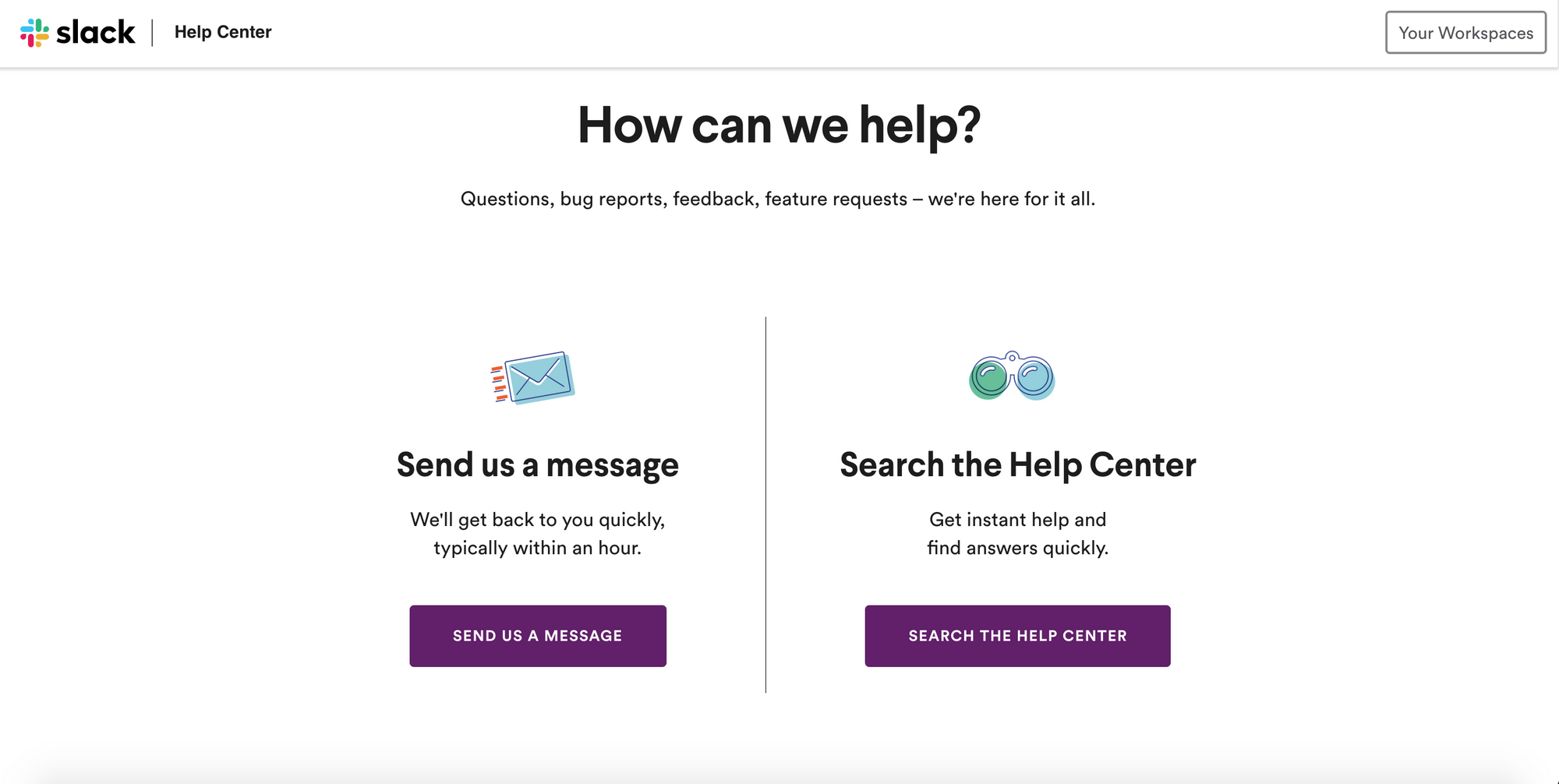
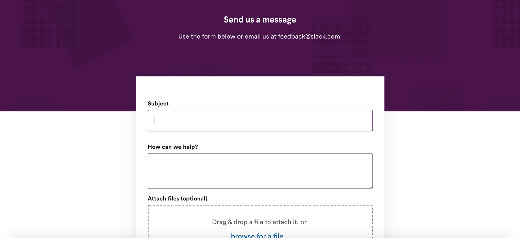
Slack has a Help and feedback link in their menu. The link takes you to their help center which prompts you to send them a message or search their help center.
The first header on the page, the question How can we help? shows the user that Slack cares about them and does indeed want to help. The sub header Questions, bug reports, feedback and feature requests - we're here for it all ensures the user there is someone at the end of the line waiting for them and that they are willing to listen to anything you have to say. Their message is extremely empathetic to the user and conveys that Slack wants to help you, are there for you and want to listen to what you have to say.
Evernote
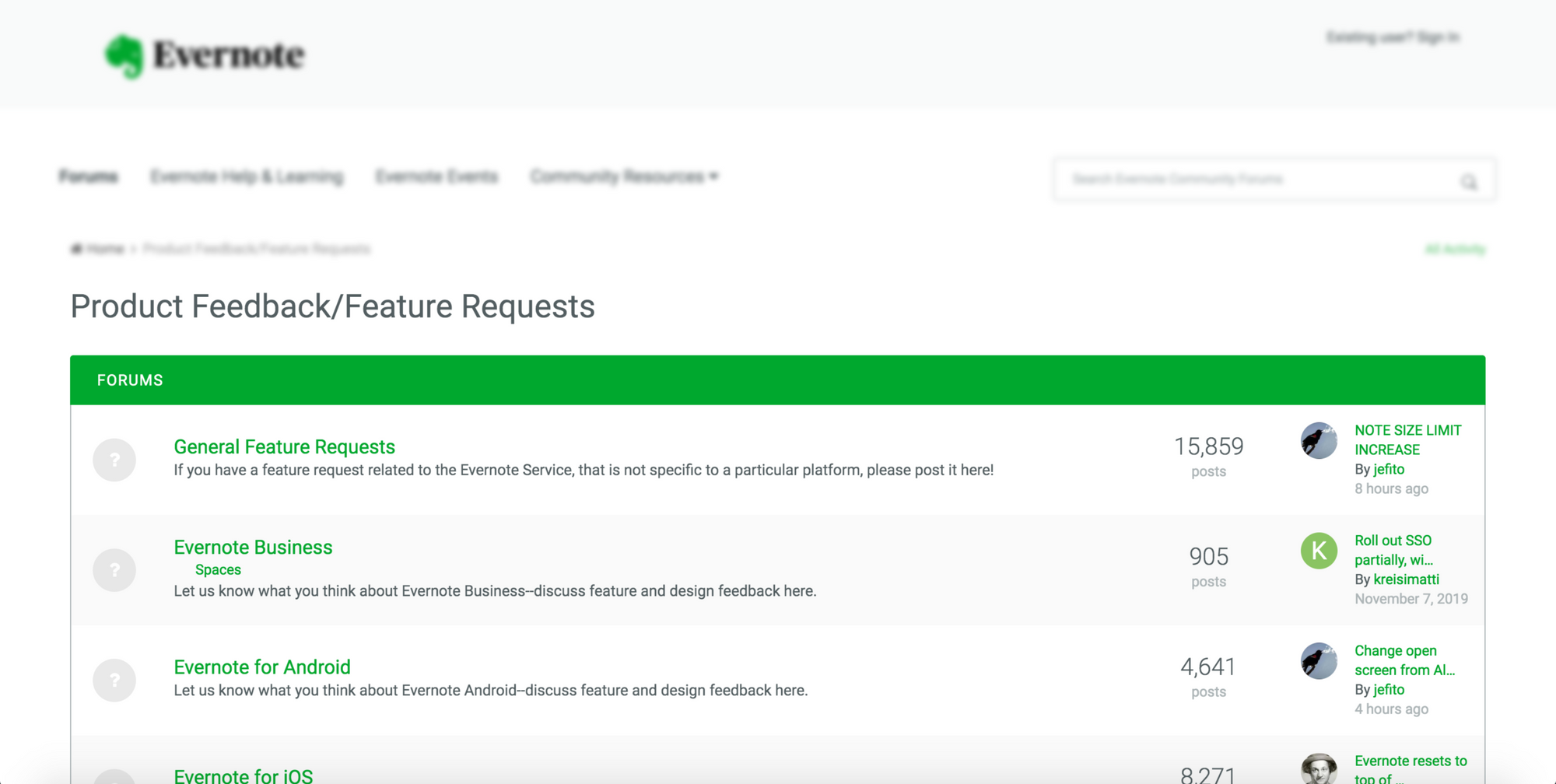
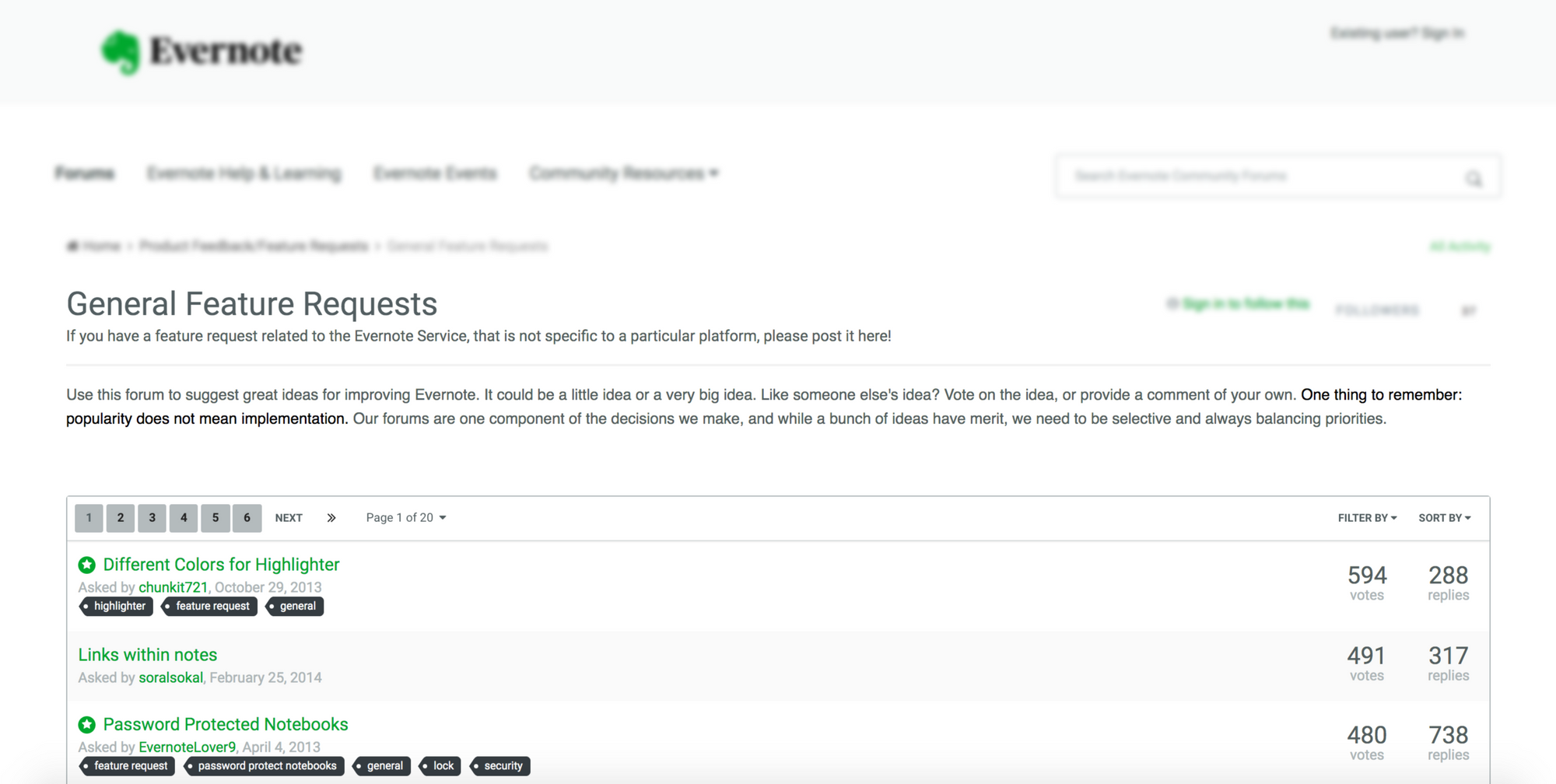
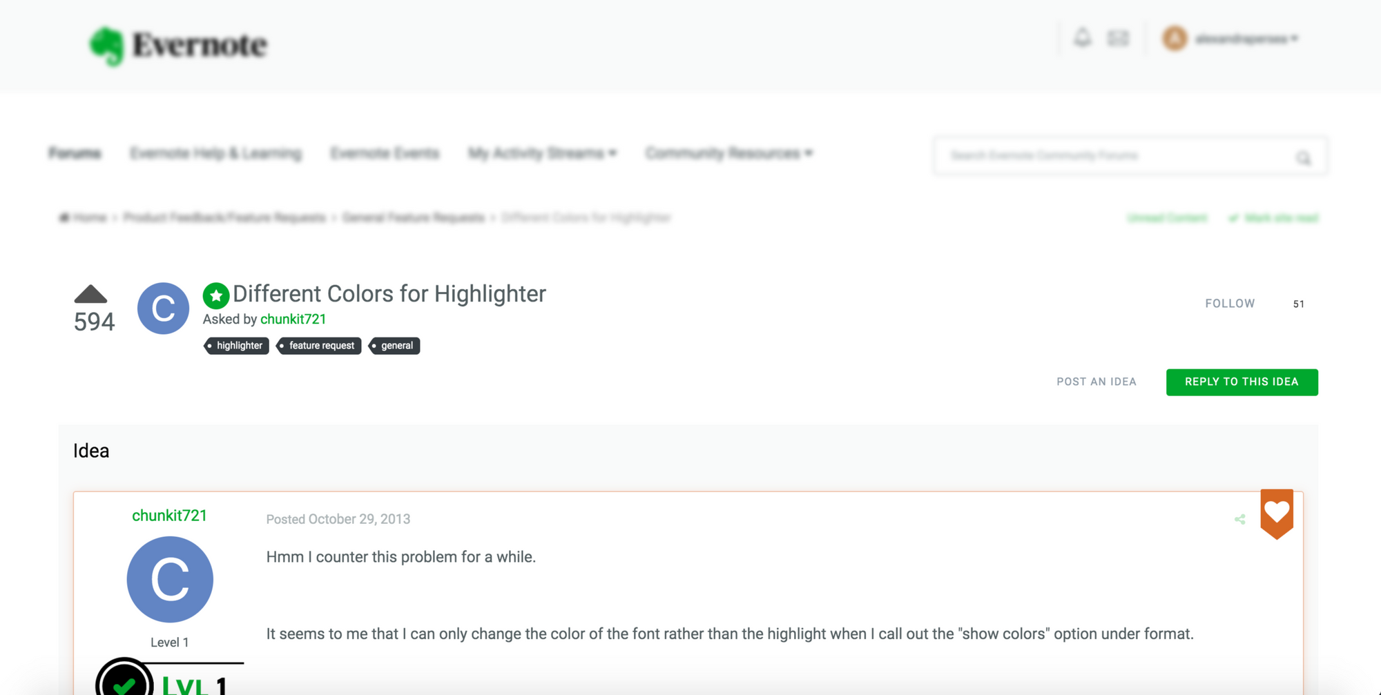
Evernote goes one step ahead and uses a public board for feedback and feature requests. However, they don't have a feedback link in their dashboard to it so it's harder for users to get here.
The transparency that Evernote has, creates a sense of community and makes users attached to the company. Allowing your users to openly post, upvote and interact with each other makes them feel part of your decision making and roadmap. Whenever a new feature is added they know that they are the ones who suggested it, left comments and ultimately helped you improve your product. This is super powerful and builds customer loyalty, and makes them advocate for your product. It makes your users become product ambassadors.
Evernote has a disclaimer that says popularity does not mean implementation. They also use the term suggestion in their forum explanation section. This ultimately manages their customers' expectations and lets them know that their ideas are taken into consideration, but are not guaranteed.
While there are risks with being so transparent, the benefits will most likely outweigh the negatives.
Dropbox
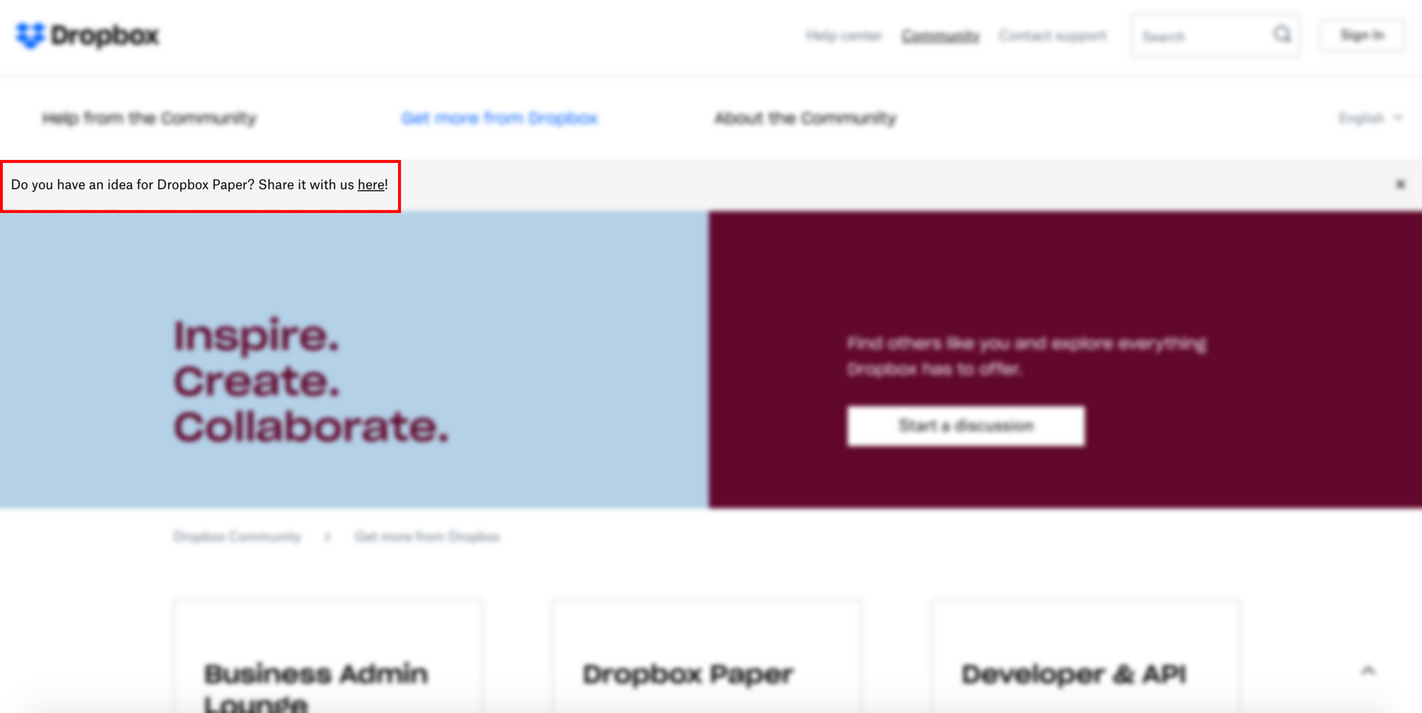
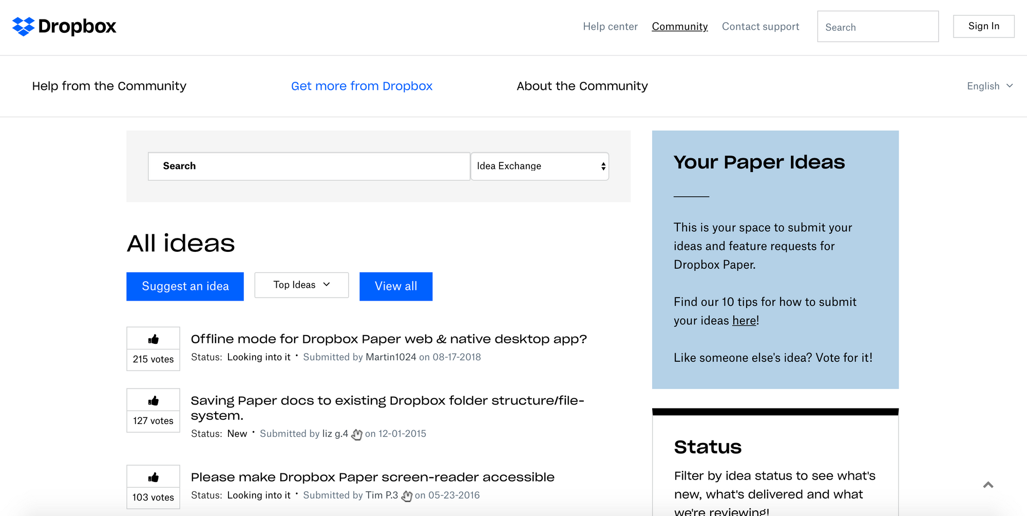
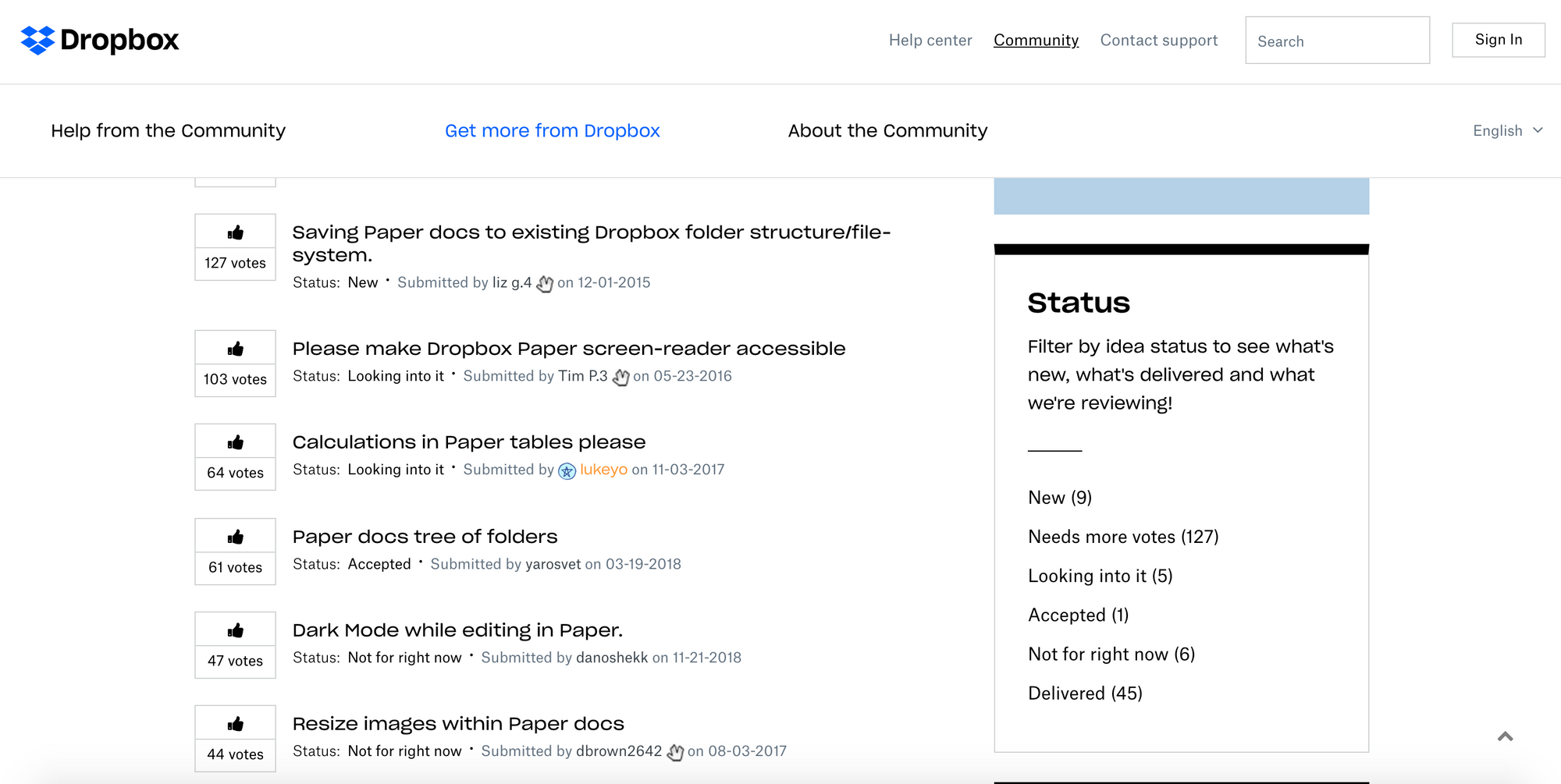
Similarly, Dropbox users a public board for suggestions and feature requests. The most upvoted ideas rise to the top so Dropbox can easily notice what their customers' biggest needs are.
They also assign statuses to their customers' suggestions so they are always in the loop with what's currently in development, what's coming and what has already been delivered. This shows commitment and accountability to the customers' suggestions.
The downside to their public forum is that you have to register a new account for the forum, even if you are already logged in Dropbox. This adds an extra step users have to take for suggesting a feature. Since the accounts are not synced, Dropbox doesn't have the context of the suggestion like Airbnb does (for example the customer persona behind the feature request and underlying patterns in their feedback).
Salesforce
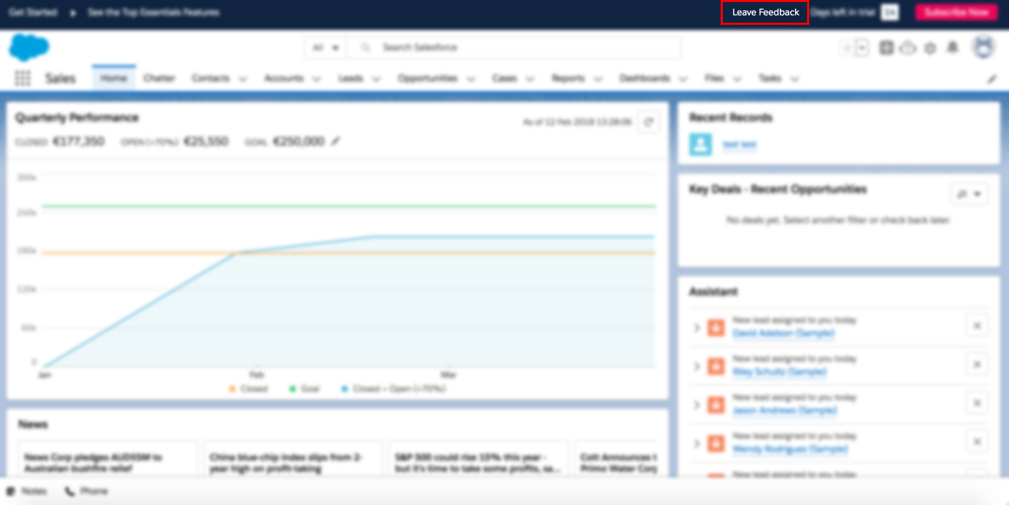
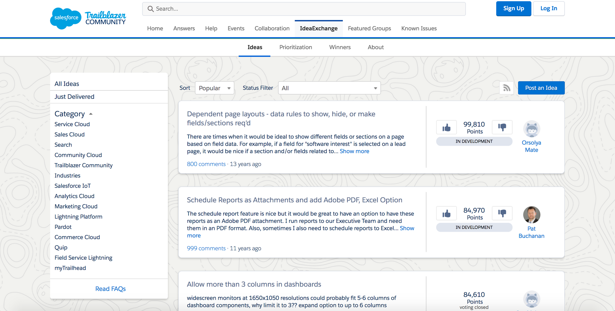
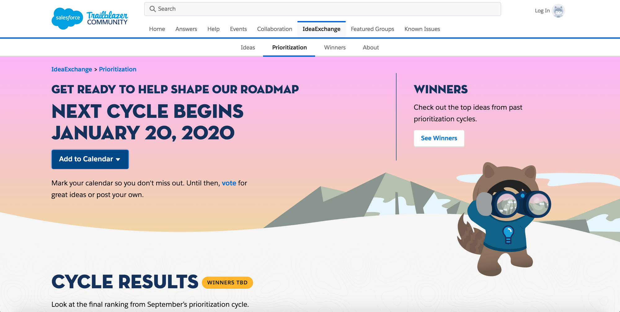
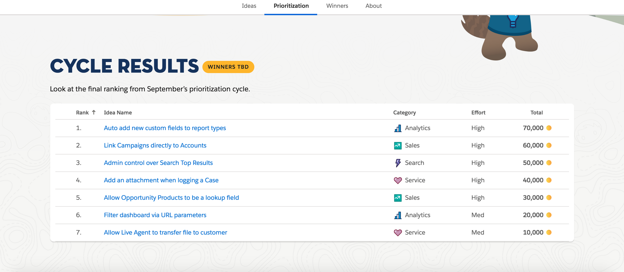
Salesforce has a subtle Feedback button in the dashboard's header and uses a public board for collecting feature ideas.
They go one step ahead and say that they let their customers shape their roadmap and introduce game-like language calling the selected ideas Winners and ranking them on board.
This makes it fun and exciting for their users not only to shape the service and products but also to see their suggestions win.
Conclusion
Collecting feedback is crucial to growth
While there are many ways to collect feedback and suggestions (email, NPS, surveys) top companies agree that collecting feedback is an essential step in improving your products and is a crucial part of growth.
An open channel ensures fresh feedback
We can also observe that top companies give users an open channel for feedback, available whenever they have an impulse to provide it. This makes giving feedback extremely easy and is valuable because this way the feedback is fresh and pure in the customer's mind.
Context is important
Context helps you analyze your customers' feedback and understand underlying problems in your current processes and specific issues that customer personas run into.
Transparency is a risk but outweighs the negatives
Being transparent and allowing your customers to take part in your decision making creates a sense of community, builds customer loyalty and turn users into product ambassadors.
Need an easy way to collect and analyze valuable feedback?
Sign Up for Acute
